As our solutions become broader and more powerful, we’ve struggled to keep our branding relevant to our current and future audiences. Being innovative in a regulated, traditional industry sometimes makes it hard to cut through all the hype around technology and have our brand truly reflect our aspirational goals for being the specialty patient connector.
We reached out to our partners, future clients and past relationships, seeking guidance and a path forward.
We began a re-branding exercise with an abstract logo. After workshopping with a team of branding experts, sherpas and visionaries, we started to see a coalesced vision rising to the surface.
And then we dug deep and tapped the untainted, raw creative expertise of our team-within-the-team, and we believe the results are both surprising and profoundly relevant.
Our new branding will communicate intrinsic nimbleness, extrinsic stability and an implied state of zen-calm capability and lean rapidity in both solutions and un-confounding the conundrums and digital maladies that besiege the patient journey.
Our new branding will be as impactful to the specialty pharma space as the fax machine was in 2016, and “electronic-mail” in 2019!
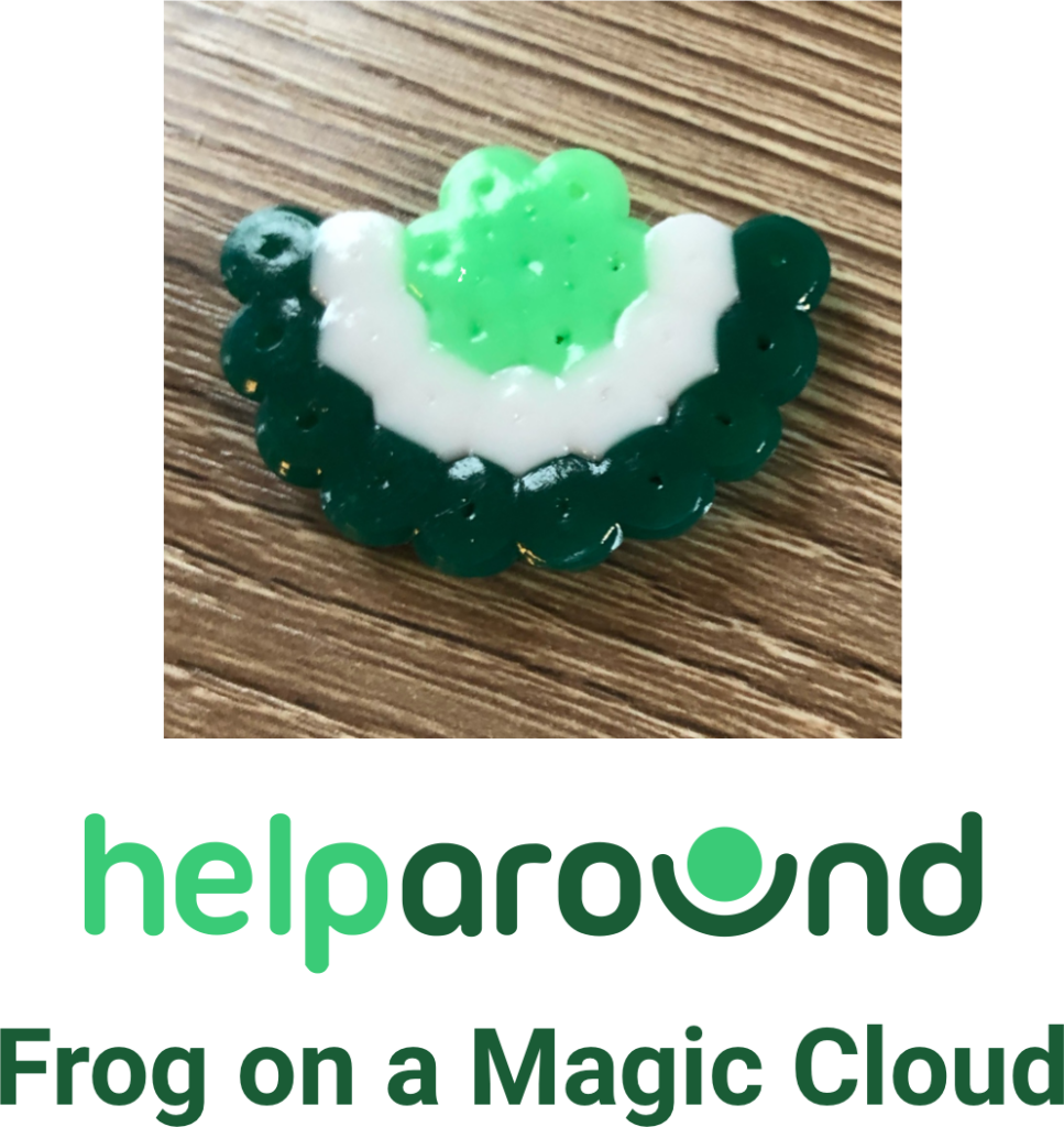
So without further ado, allow us to welcome you into our new brand:

Yep, April Fools. But totally inspired by one of our kids, who unprompted, created this and then walked into the middle of an investor meeting to show his dad. Thanks Razi for all your help creating this new branding! You have a bright future as a marketer!